2023 – 2024
Raymics Cloud
Research-led redesign for a medical AI SaaS
A radiomics platform for doctors and researchers — redesigned around activation, conversion, and clearer workflows for complex medical AI tasks.
- Role
- UX Design Lead
- Team
- Cross-functional · PM, AI engineers, SDEs, operations
- Timeline
- 2023 – 2024
- Scope
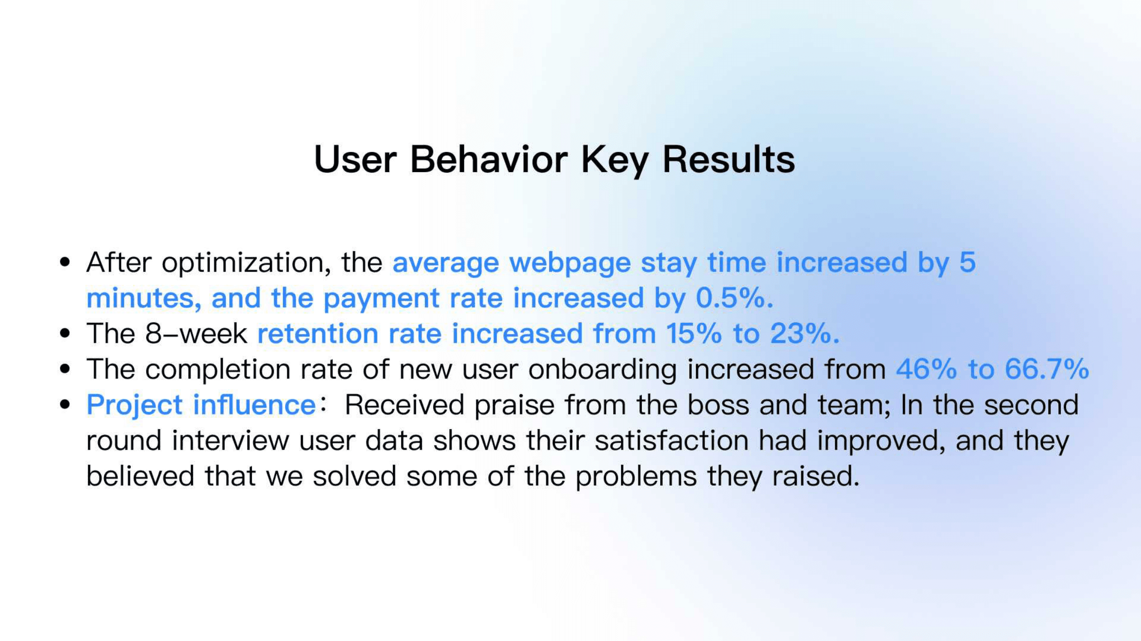
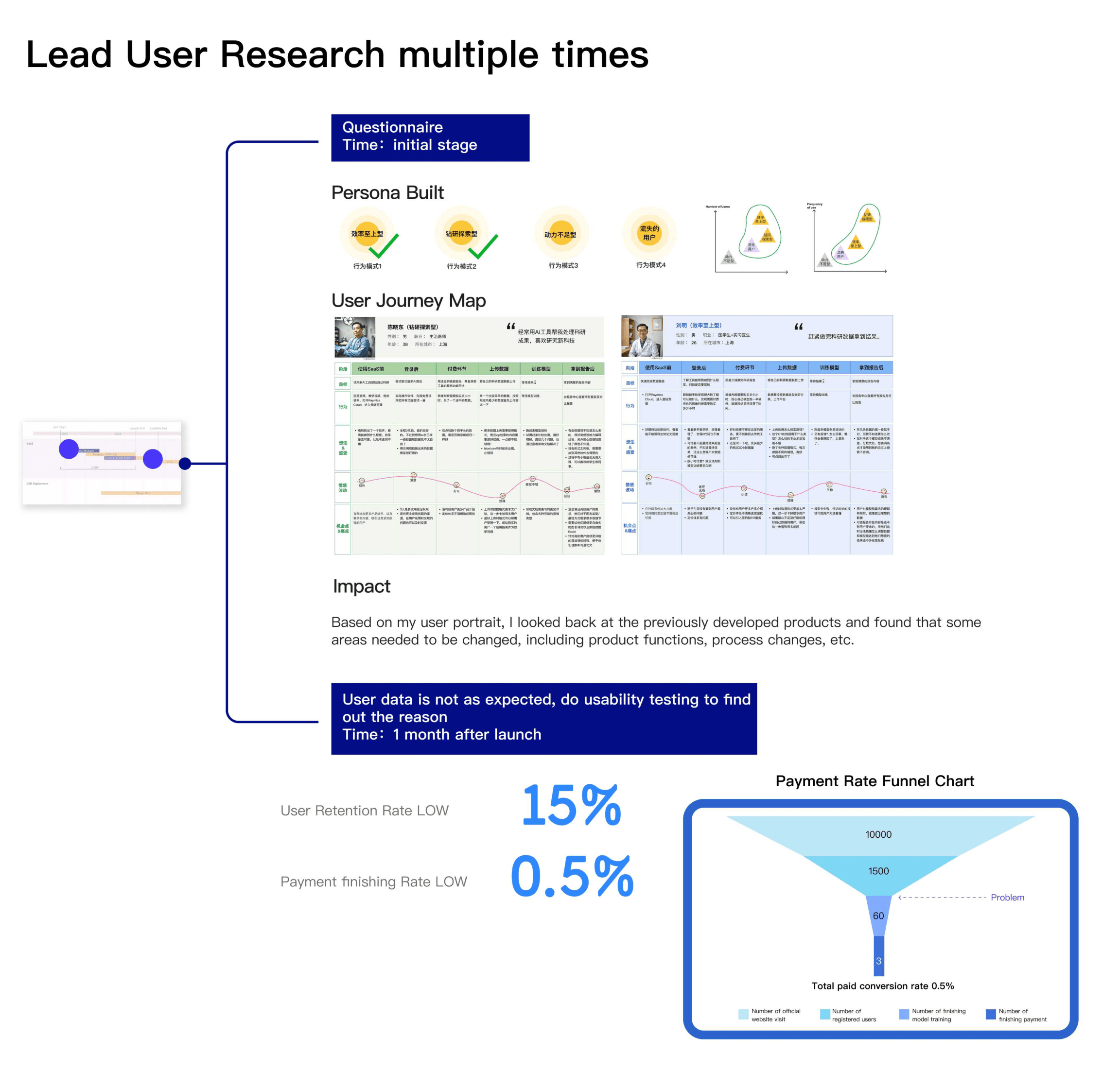
- · Led iterative user research and post-launch usability testing · Diagnosed low retention (15%) and payment completion (0.5%) · Redesigned onboarding, navigation, membership, and payment flows · Anchored a design system later extended to on-prem and federated products
Overview
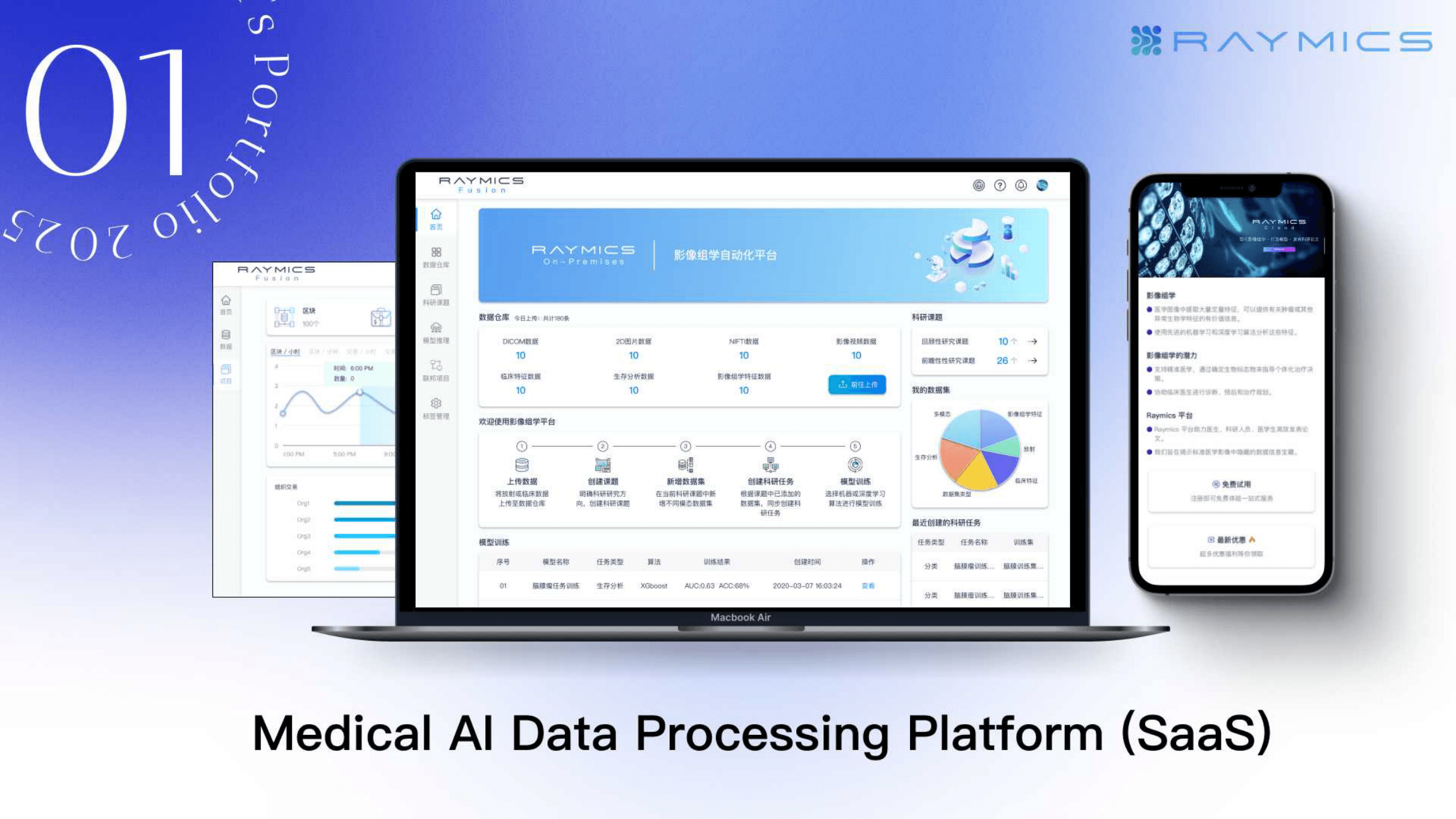
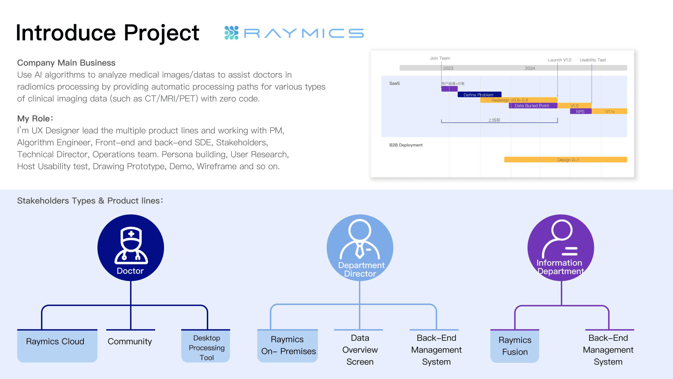
Raymics uses AI to analyze medical images (CT, MRI, PET) and offers zero-code paths for radiomics processing. I led UX across product lines — personas, research, usability testing, wireframes, and prototyping — with Raymics Cloud as the primary SaaS surface for doctors.
Finding the problem
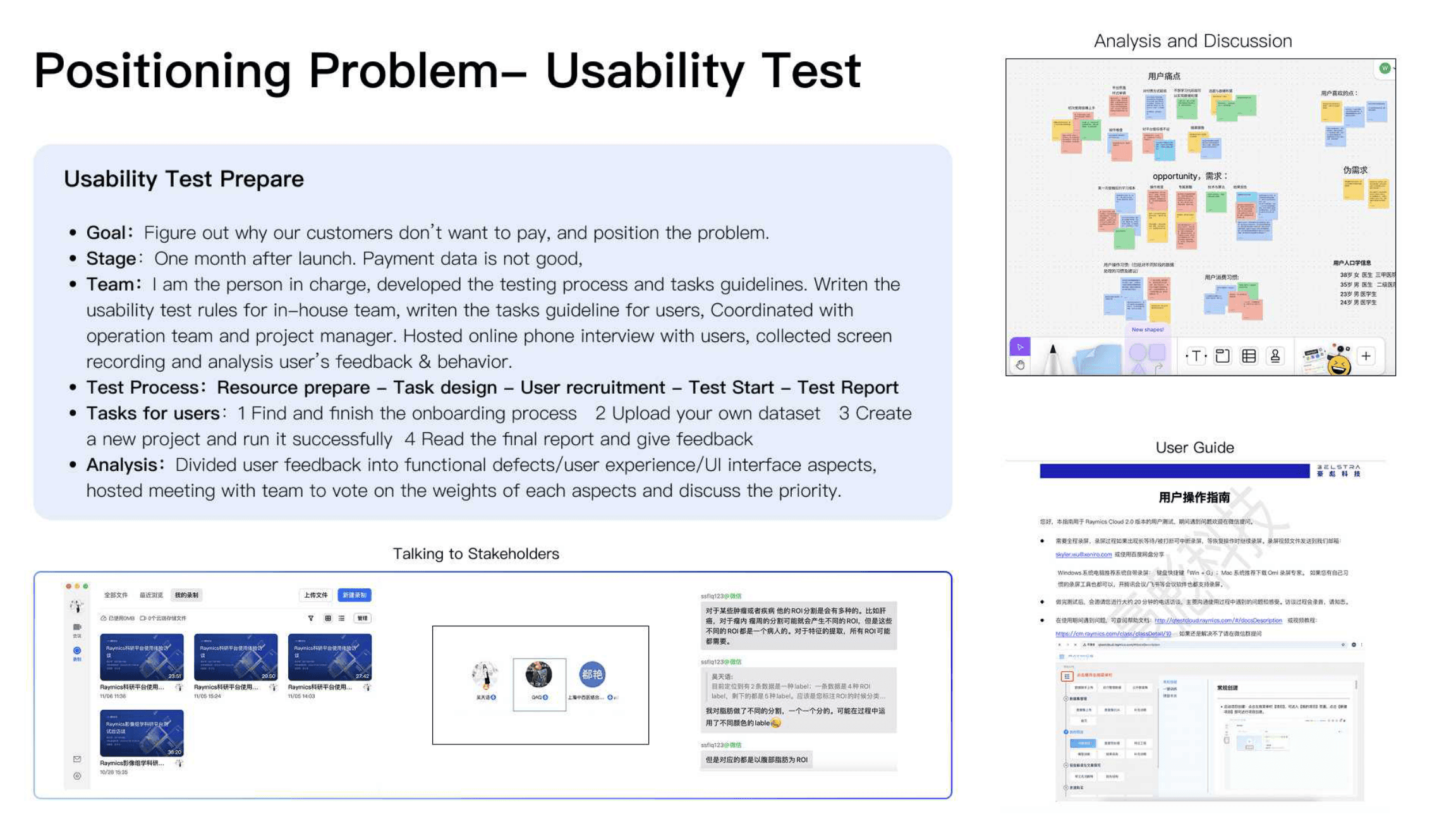
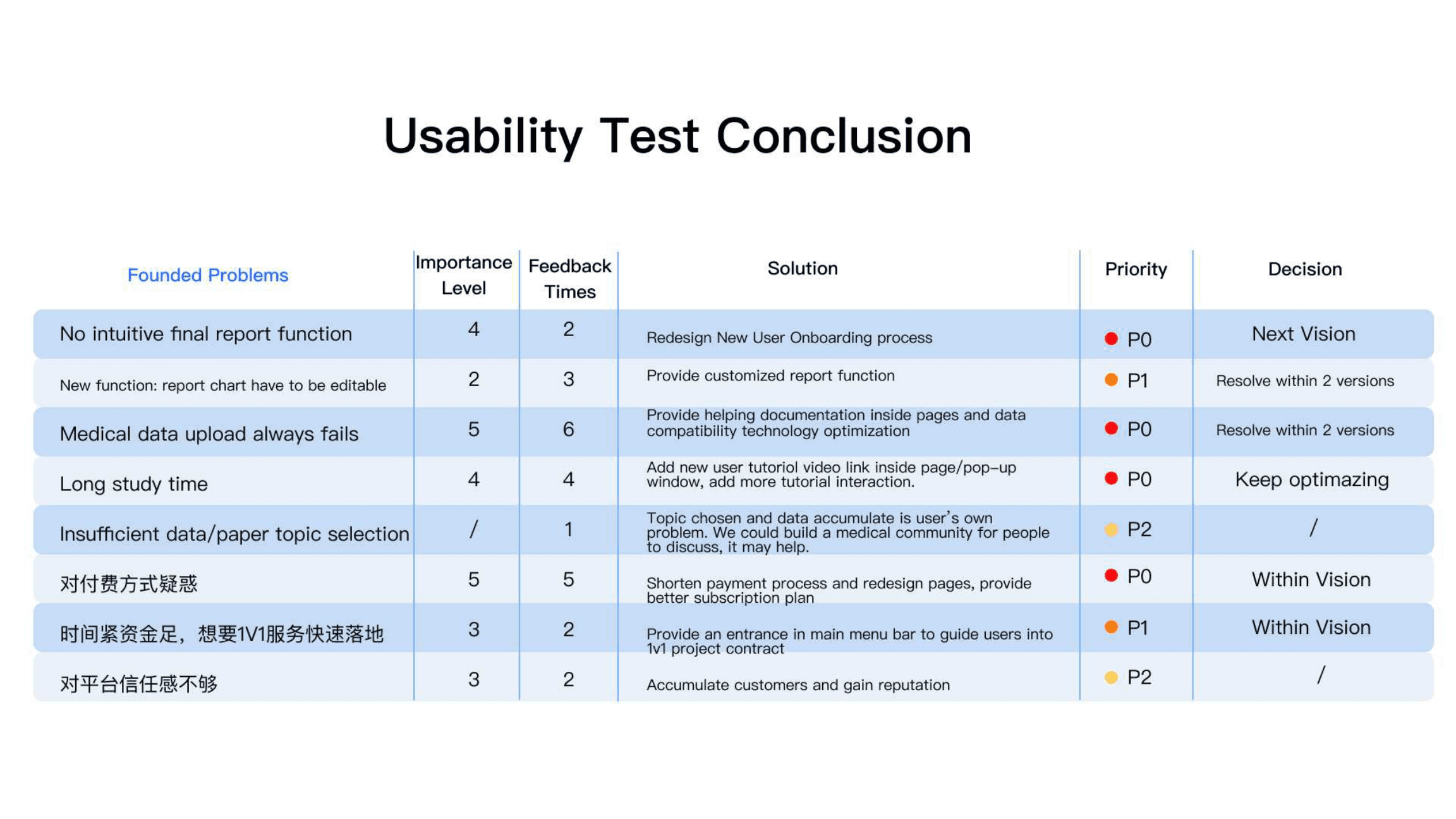
After launch, retention sat at 15% and payment completion at 0.5%. A funnel from site visits → register → train model → pay showed the steepest drop between registration and finishing a training run. I led usability testing one month post-launch to find why customers would not convert.
Design strategy
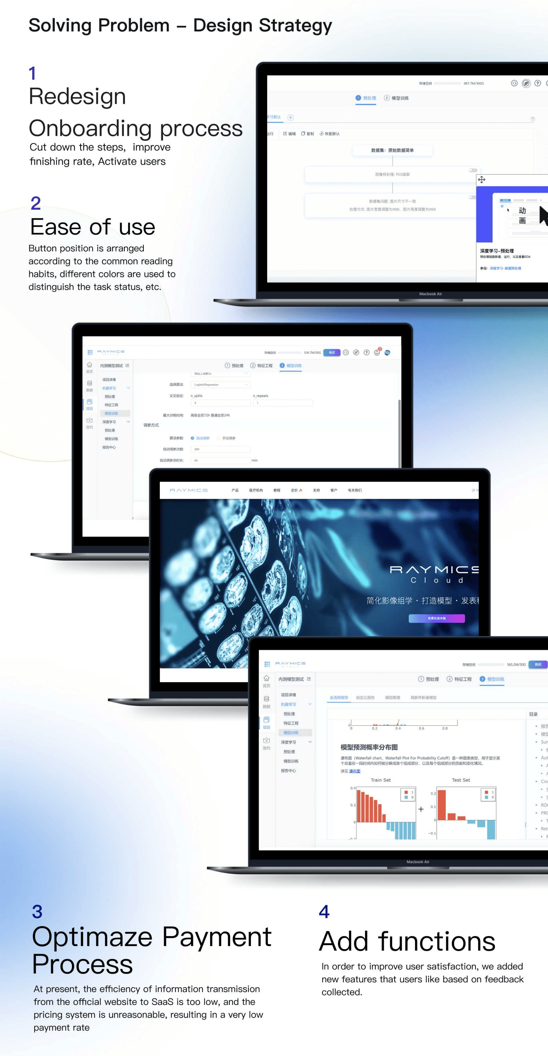
We focused on four moves: shorten onboarding to raise activation, improve ease of use for expert-dense screens, clarify payment and membership, and ship feedback-driven features that made model results more trustworthy.
Onboarding
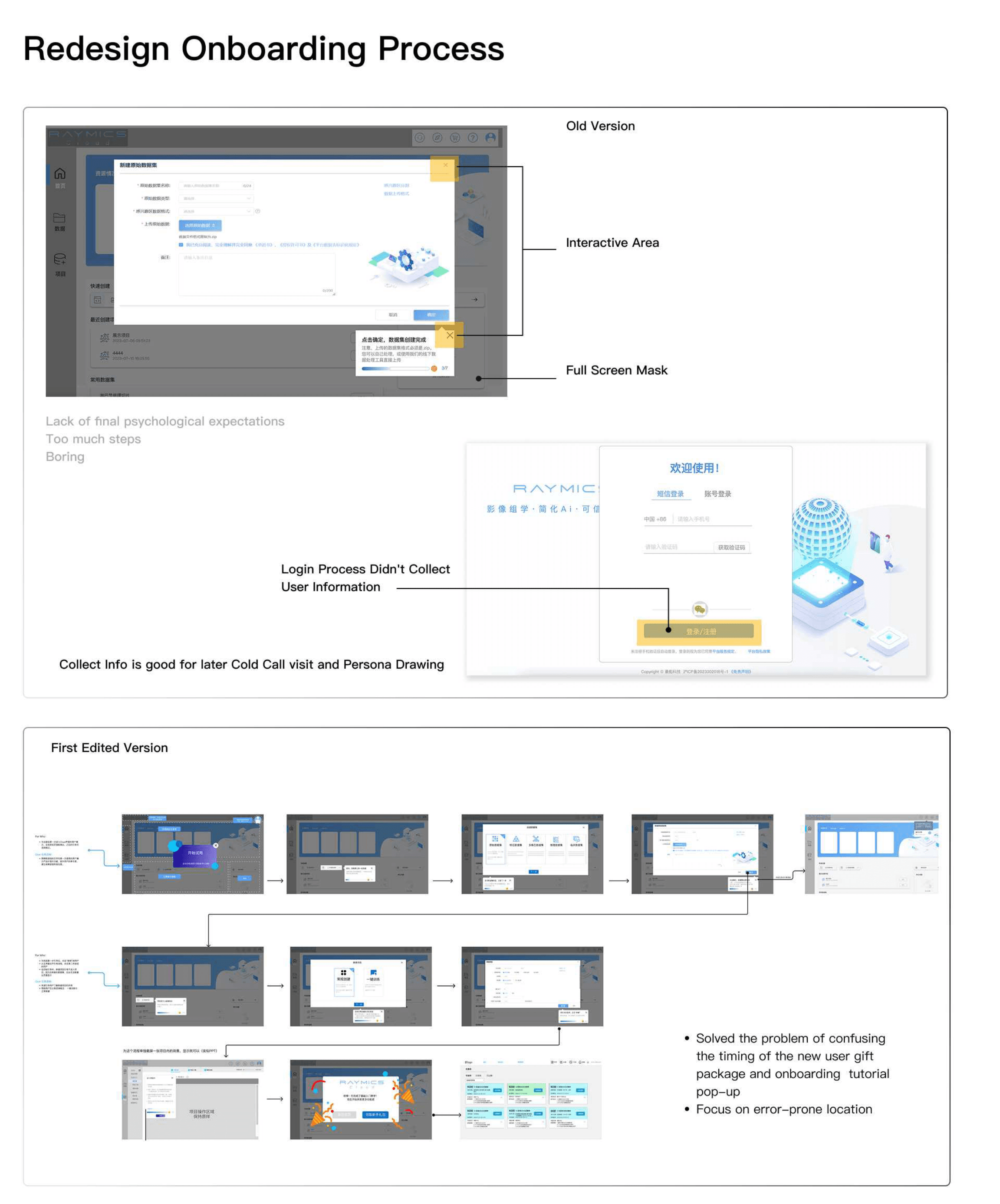
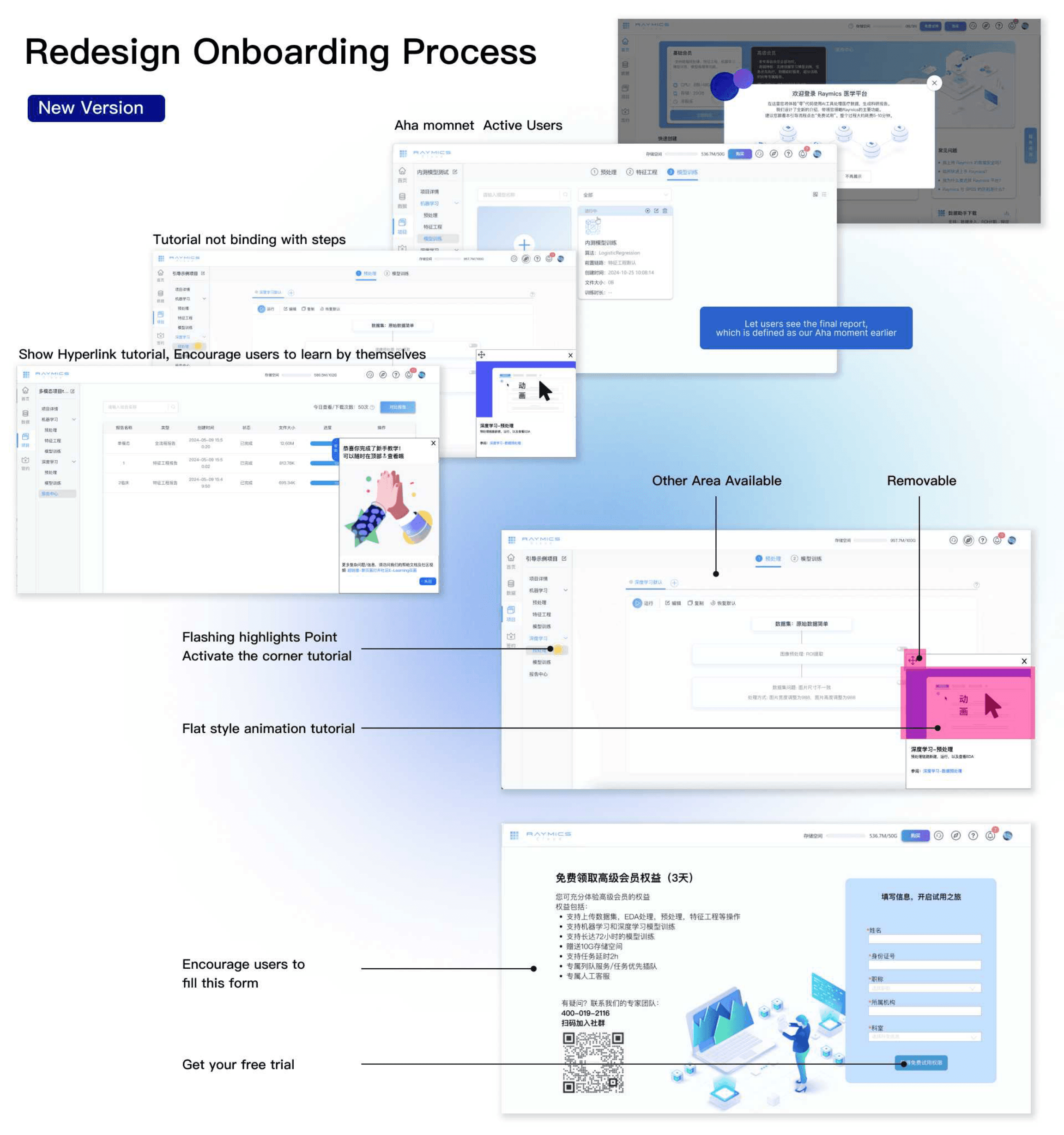
We shortened the first-run path and redesigned onboarding so new users reach an aha moment faster — with self-led tutorials and a clearer free-trial entry.
Ease of use
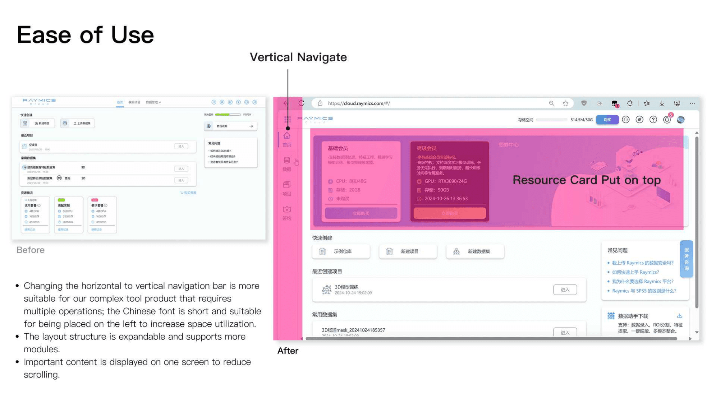
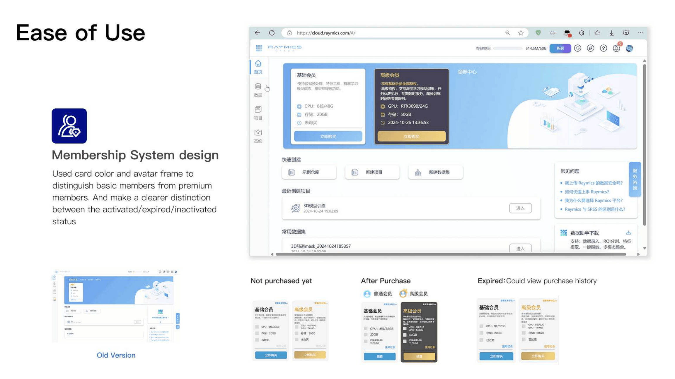
Horizontal navigation gave way to a vertical rail better suited to a multi-module tool. Membership cards, status cues, and in-app help made expert workflows easier to scan and recover from.

Payment & membership
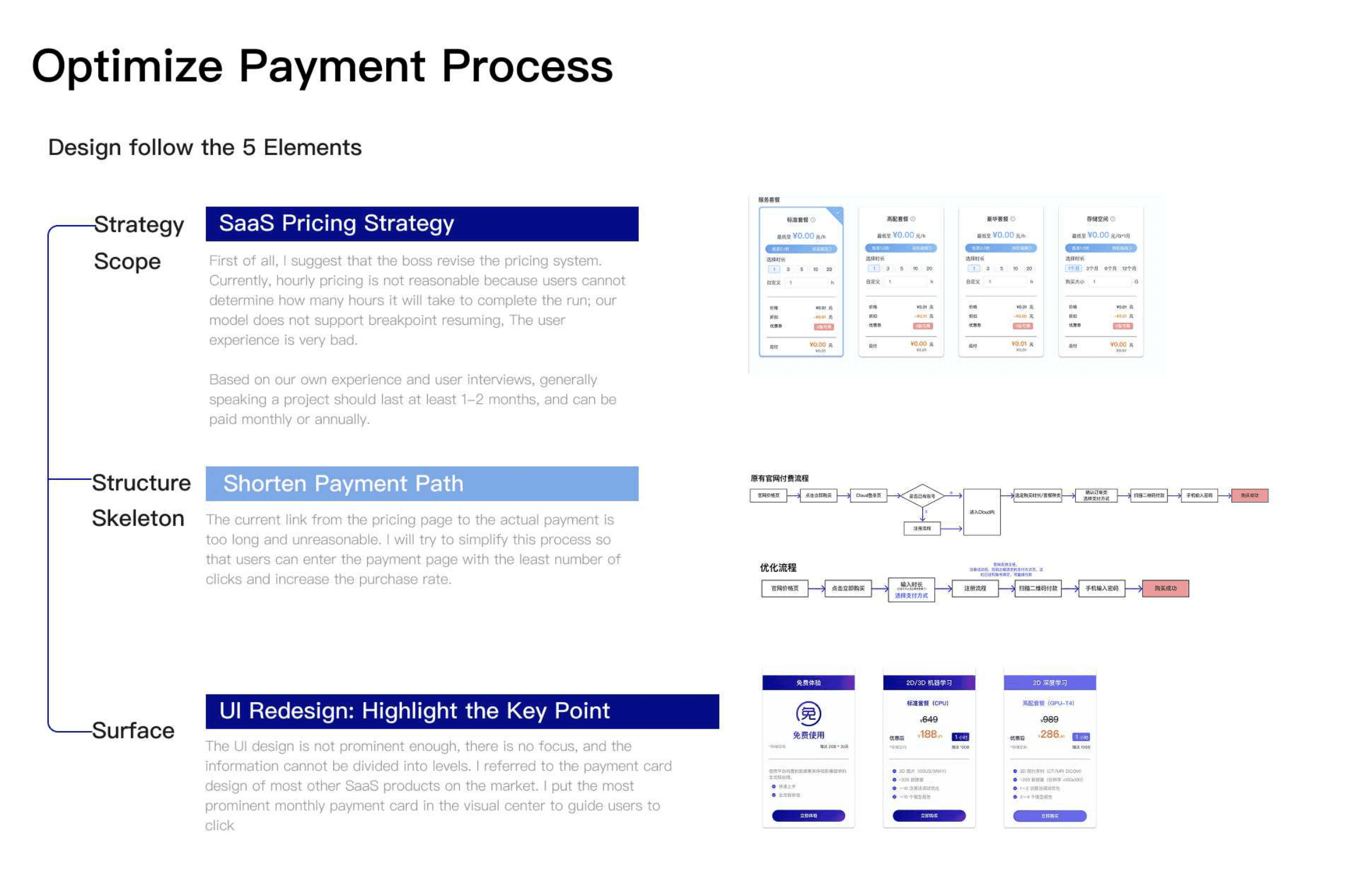
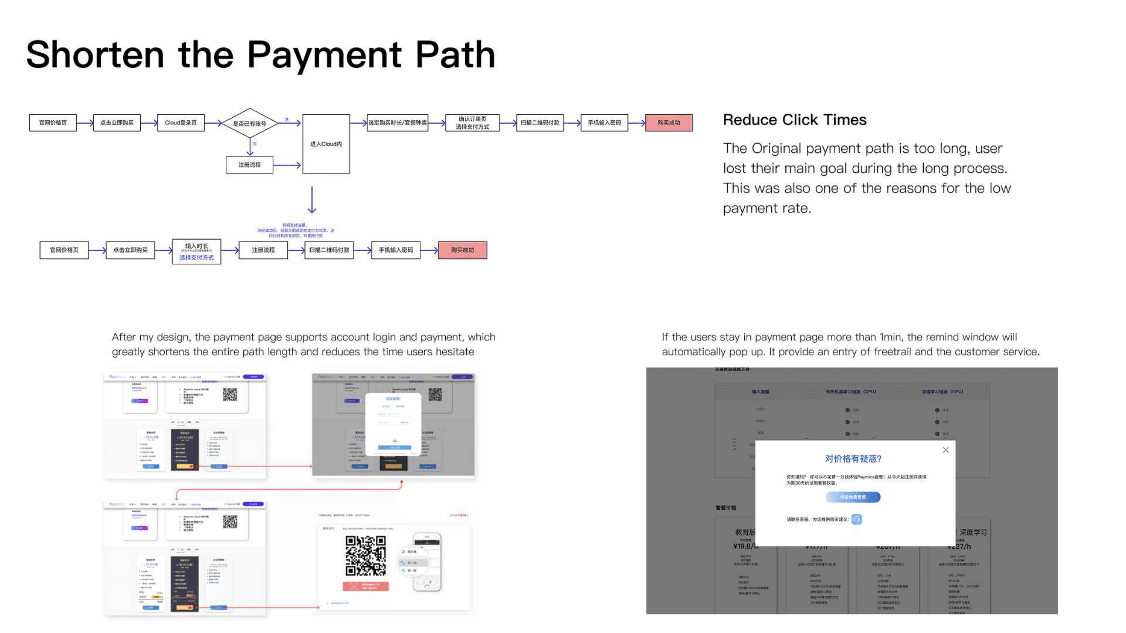
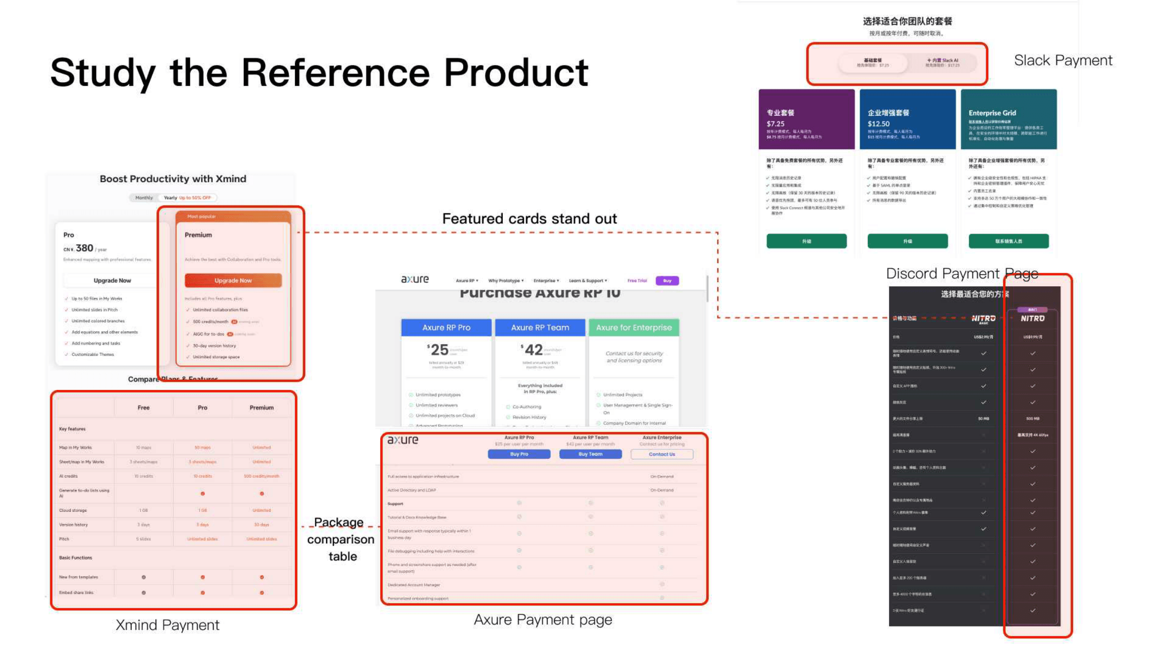
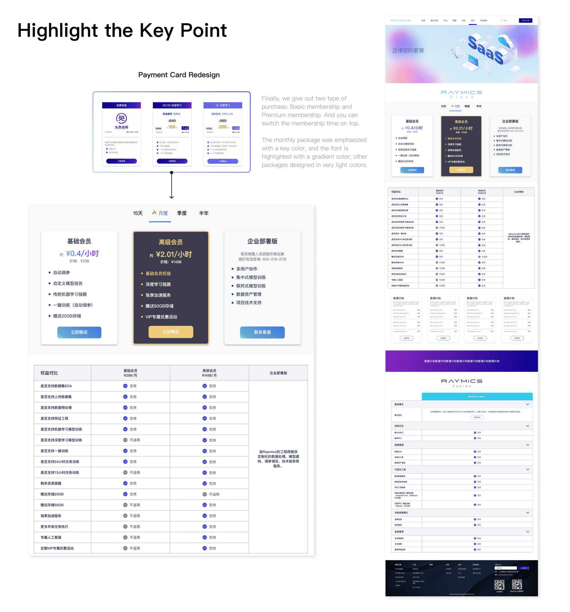
We clarified pricing, shortened the purchase path, and redesigned payment cards so Basic, Premium, and Enterprise options were easier to compare and buy.
New features
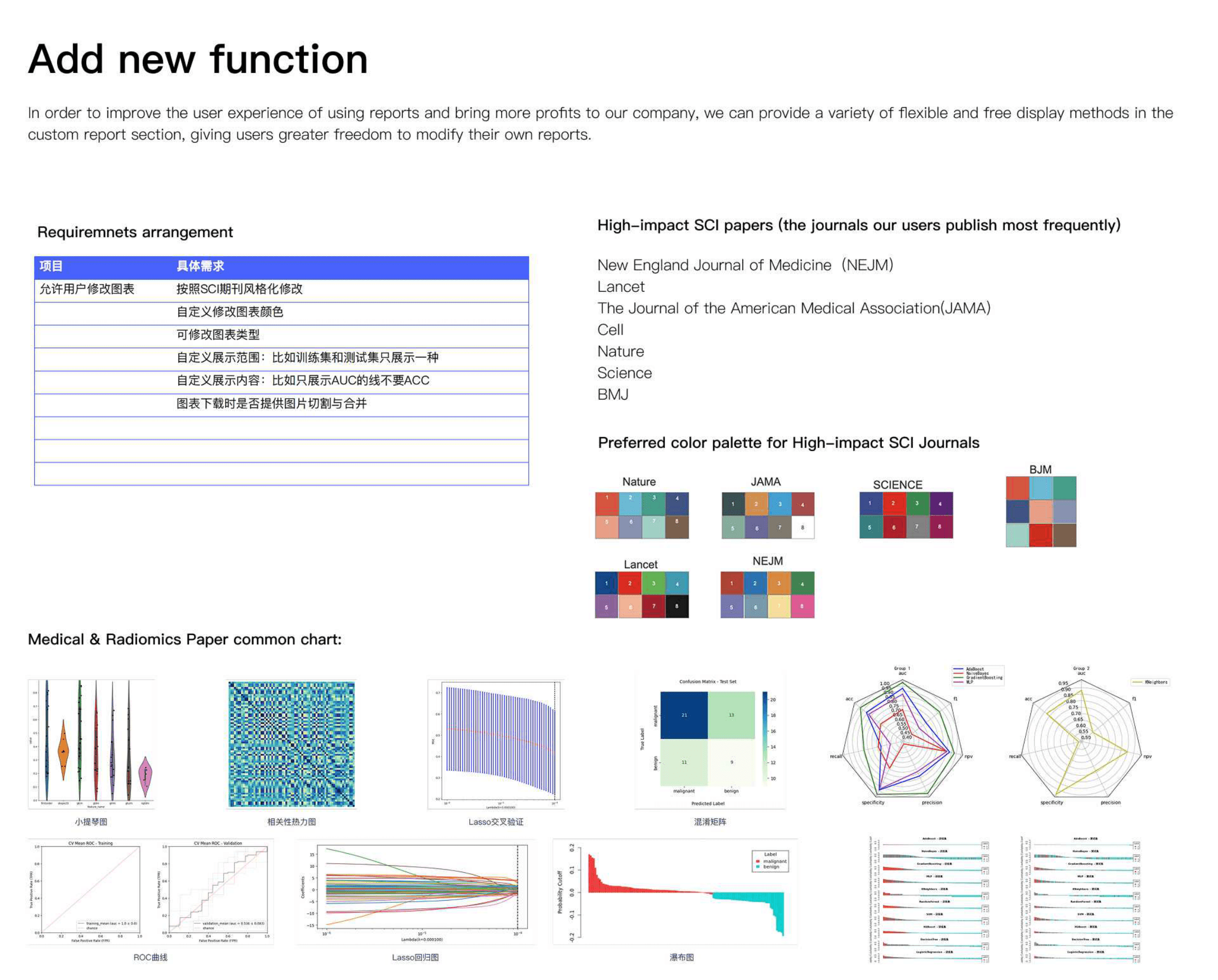
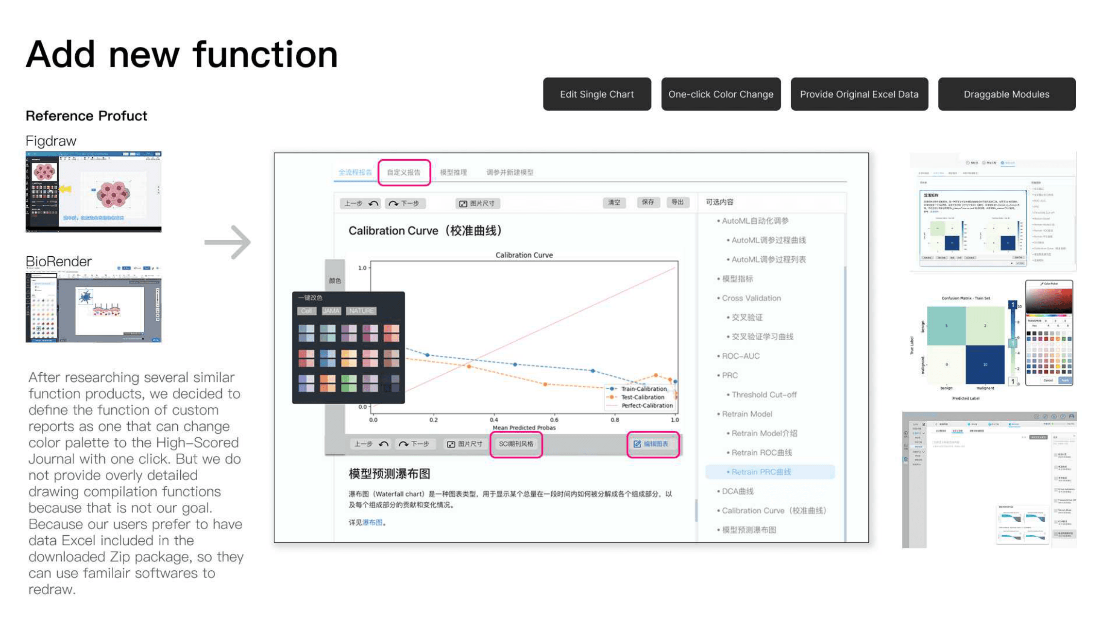
Based on usability feedback, we added custom research charts and reports so users could prepare journal-ready visuals without leaving the product.
Cross-product & other surfaces
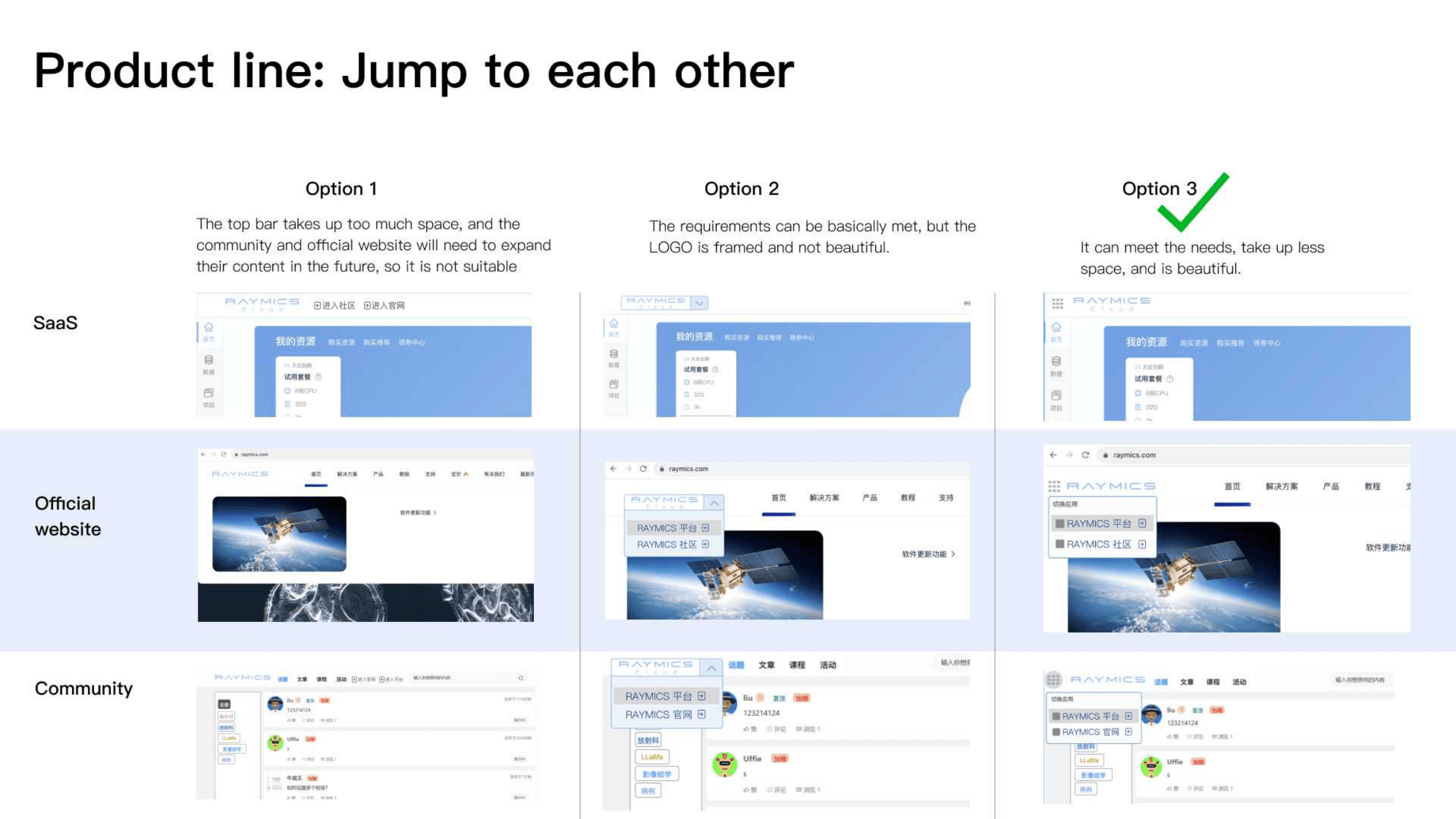
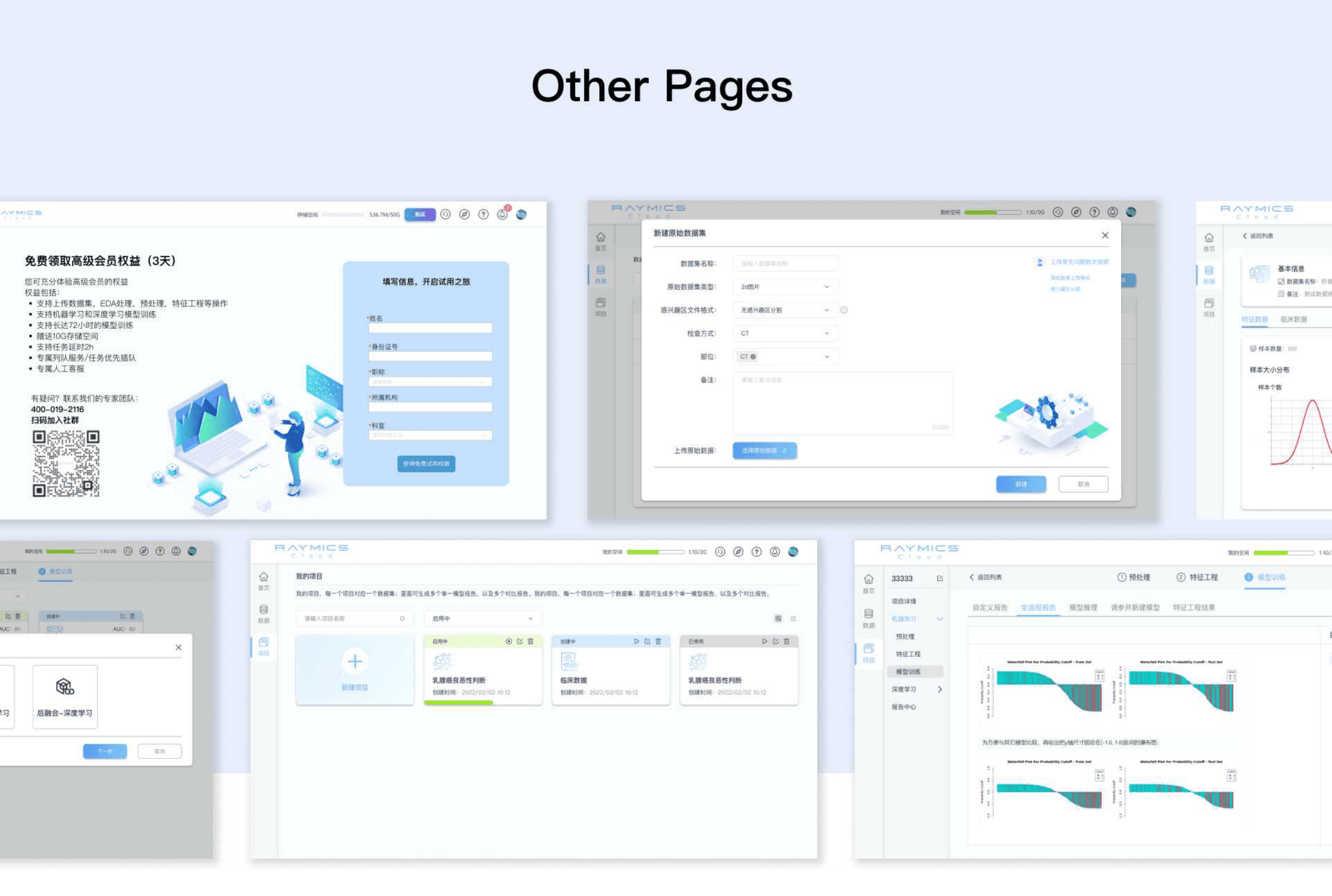
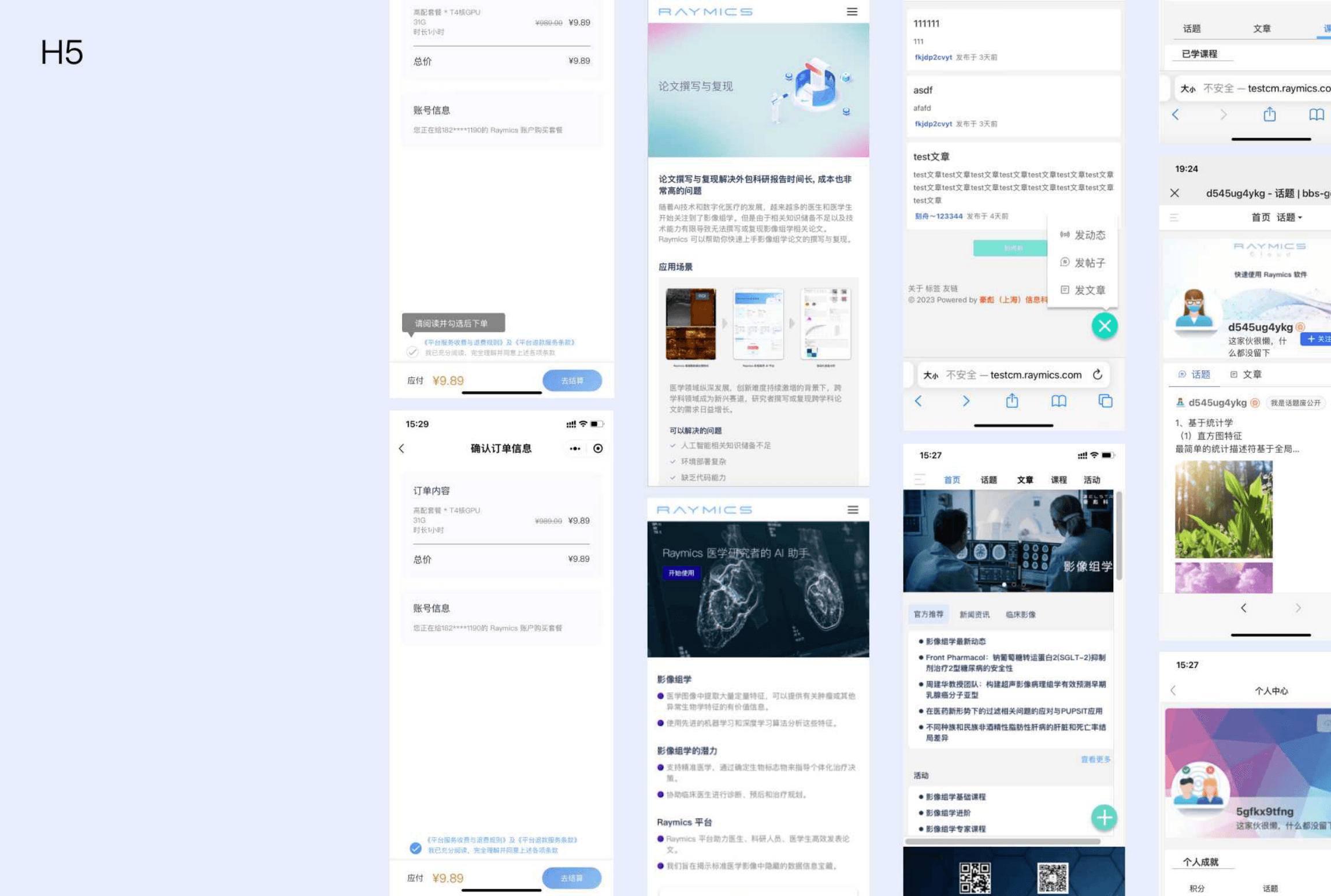
We connected SaaS, the marketing site, and community surfaces, and shipped supporting pages plus H5 mobile flows so the experience stayed coherent across channels.
Design system
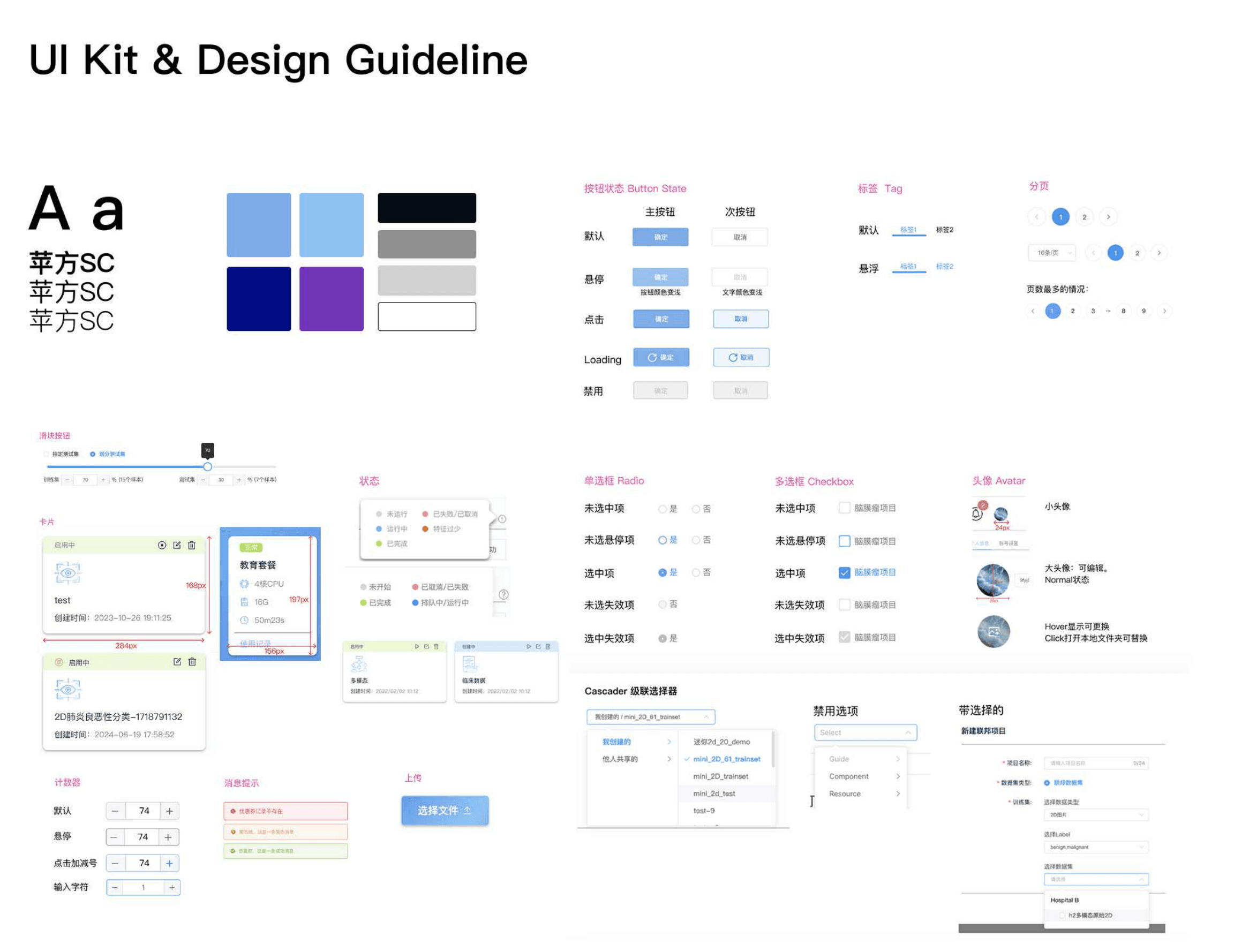
Cloud became the design-language anchor for the rest of the Raymics suite — including hospital on-premises deployment and federated learning — so researchers could move between products without relearning the system.
Results
After optimization, retention, onboarding completion, and payment behavior moved in the right direction — and follow-up interviews confirmed we had addressed several of the problems users raised.